WMAP Science on a Sphere Microwave Sky Images
| |||||||||||||||||||||||||||||||||||||||||||||||||||||||||||||||
|
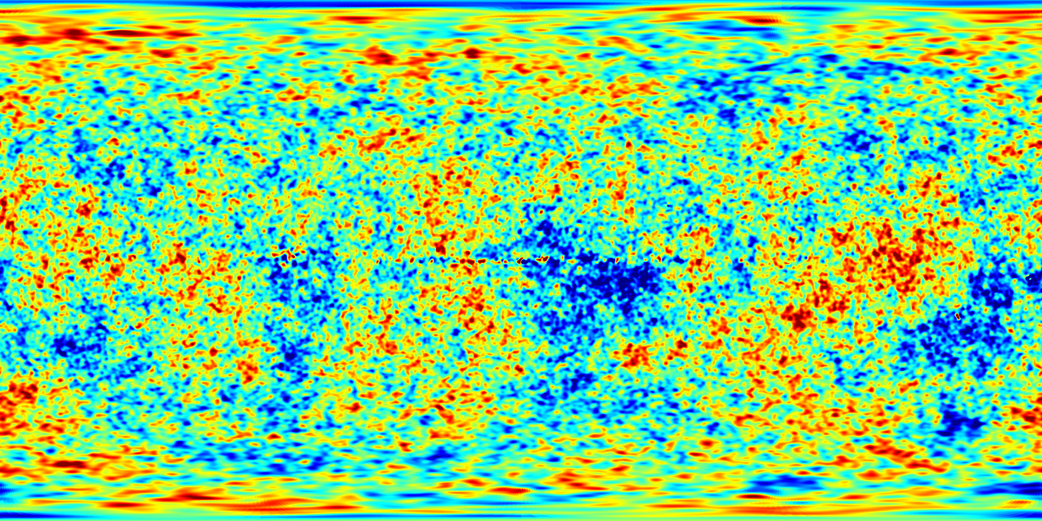
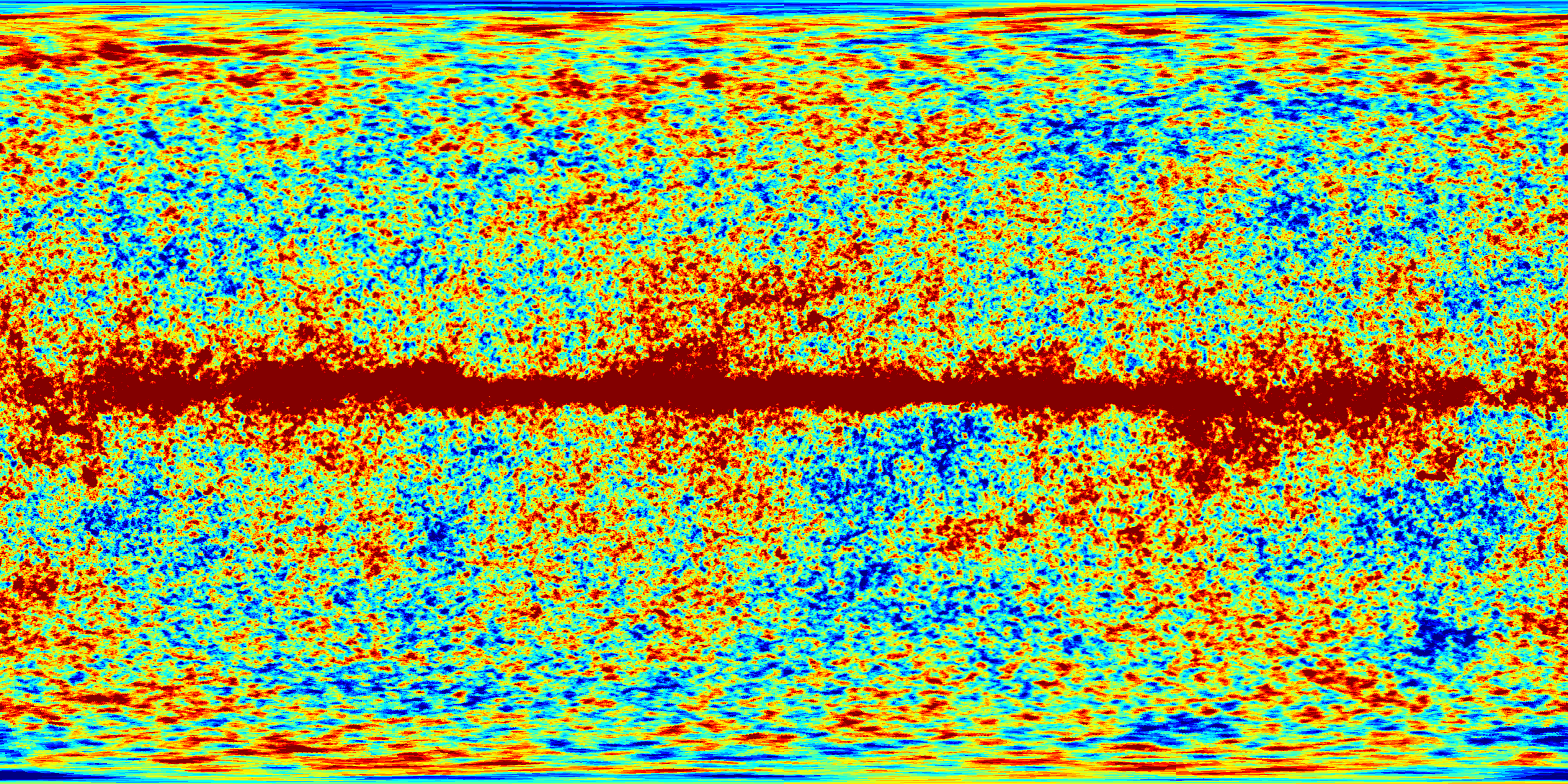
The first image shows the CMB fluctuations from the Seven Year WMAP survey. The average brightness corresponds to a temperature of 2.725 Kelvins (degrees above absolute zero; equivalent to -270 C or -455 F). The colors represent temperature variations, as in a weather map: red regions are warmer and blue regions are colder than average by 0.0002 degrees. This map was formed from the five frequency bands shown below in such a way as to suppress the signal from our own Milky Way Galaxy. |
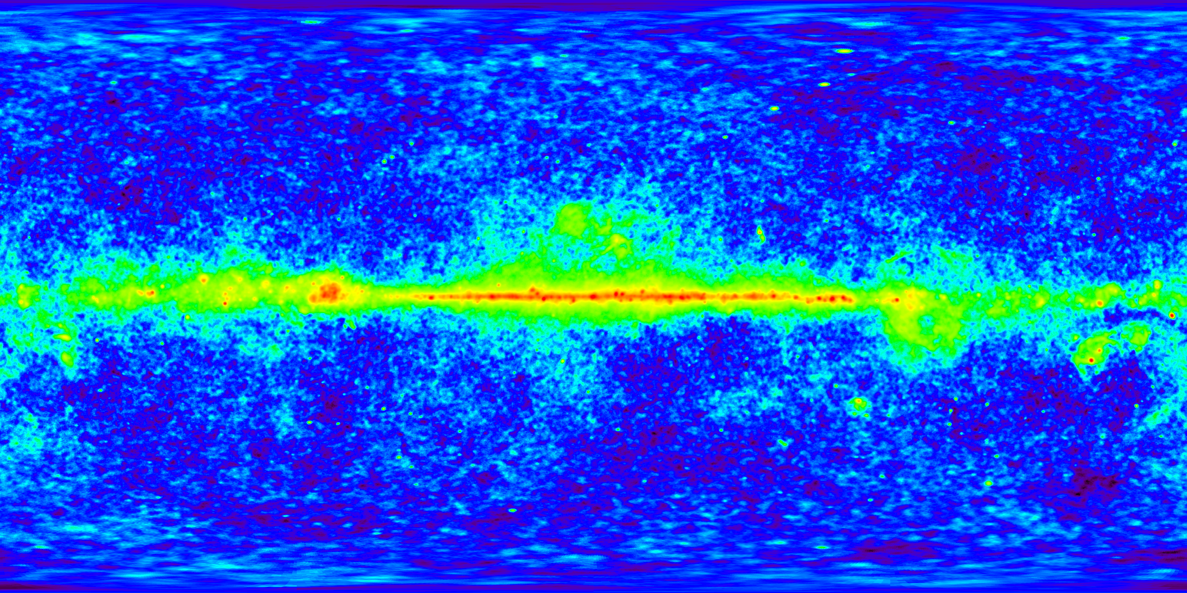
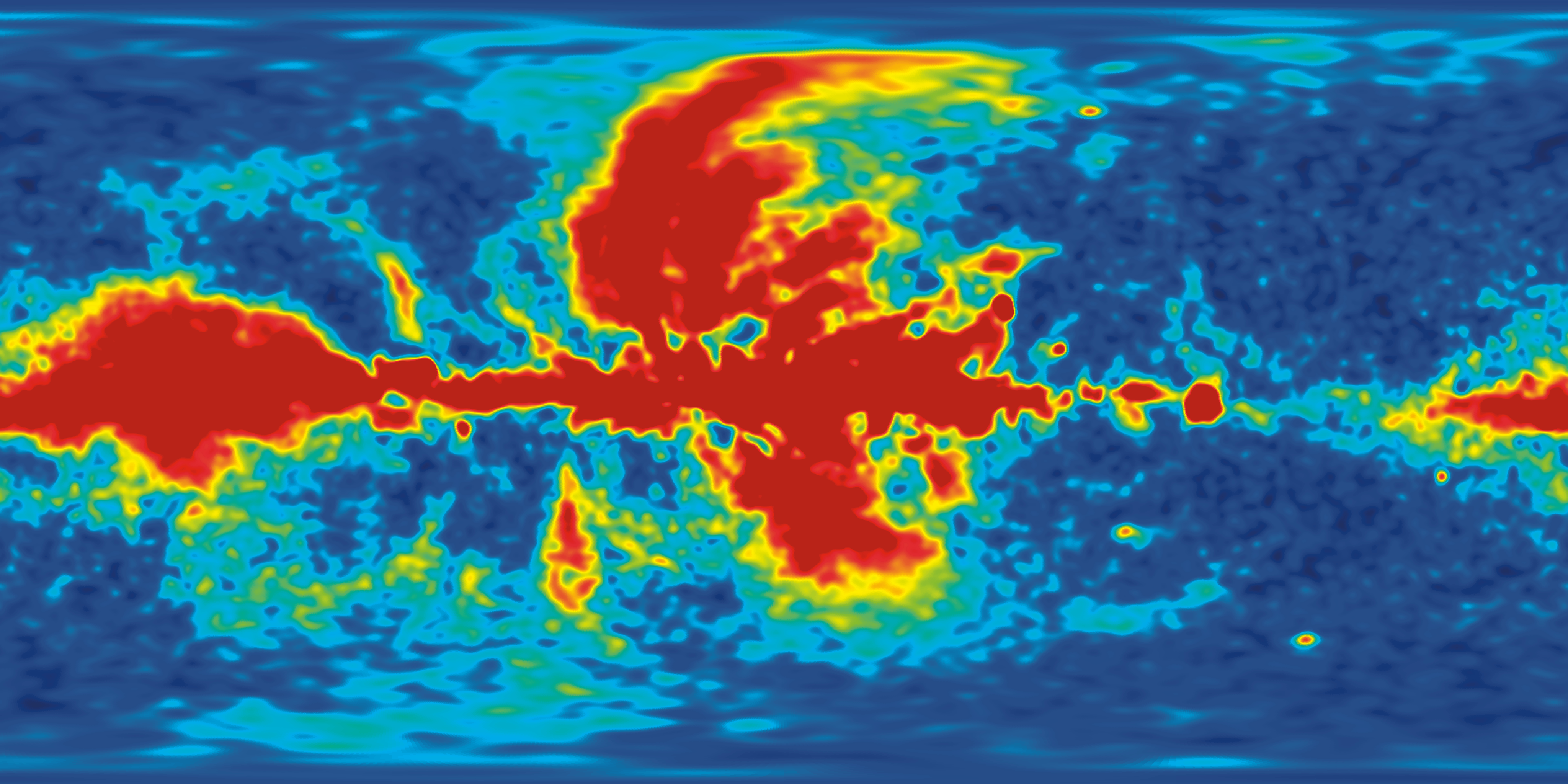
WMAP Seven Year Frequency Band Maps (Linear Color Scale) |
||||
 K Band -- 23 GHz |
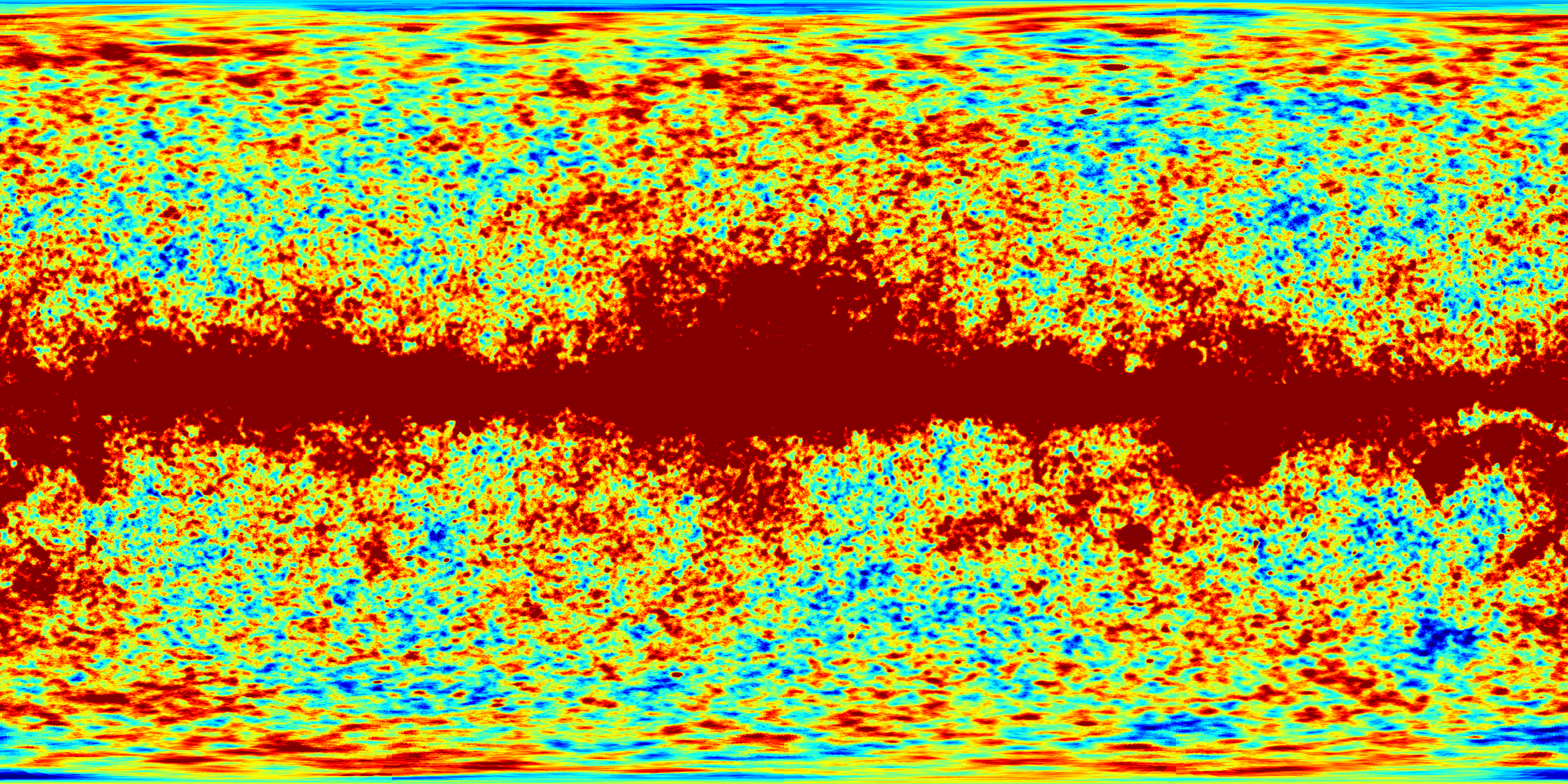 Ka Band -- 33 GHz |
 Q Band -- 41 GHz |
 V Band -- 61 GHz |
 W Band -- 94 GHz |
| In addition to the CMB, our own Milky Way Galaxy is a source of microwave radiation. Fortunately, the two sources have a different frequency spectrum (or "color"), so they can be separated using multifrequency observations. WMAP uses 5 frequency bands to discern CMB emission from Galactic emission: 23, 33, 41, 61, and 94 GHz. These five images show the microwave brightness measured in each frequency band. The signal is measured in units of Kelvins, and the color scale goes from blue at -0.0002 Kelvins below average (-200 microKelvins) to red at 0.0002 Kelvins above average (+200 microKelvins). The red band running through the center of the image is the emission from our Milky Way, which is much brighter than the CMB signal. By combining these five images in a particular way (shown above), we can suppress the signal from the Milky Way. | ||||
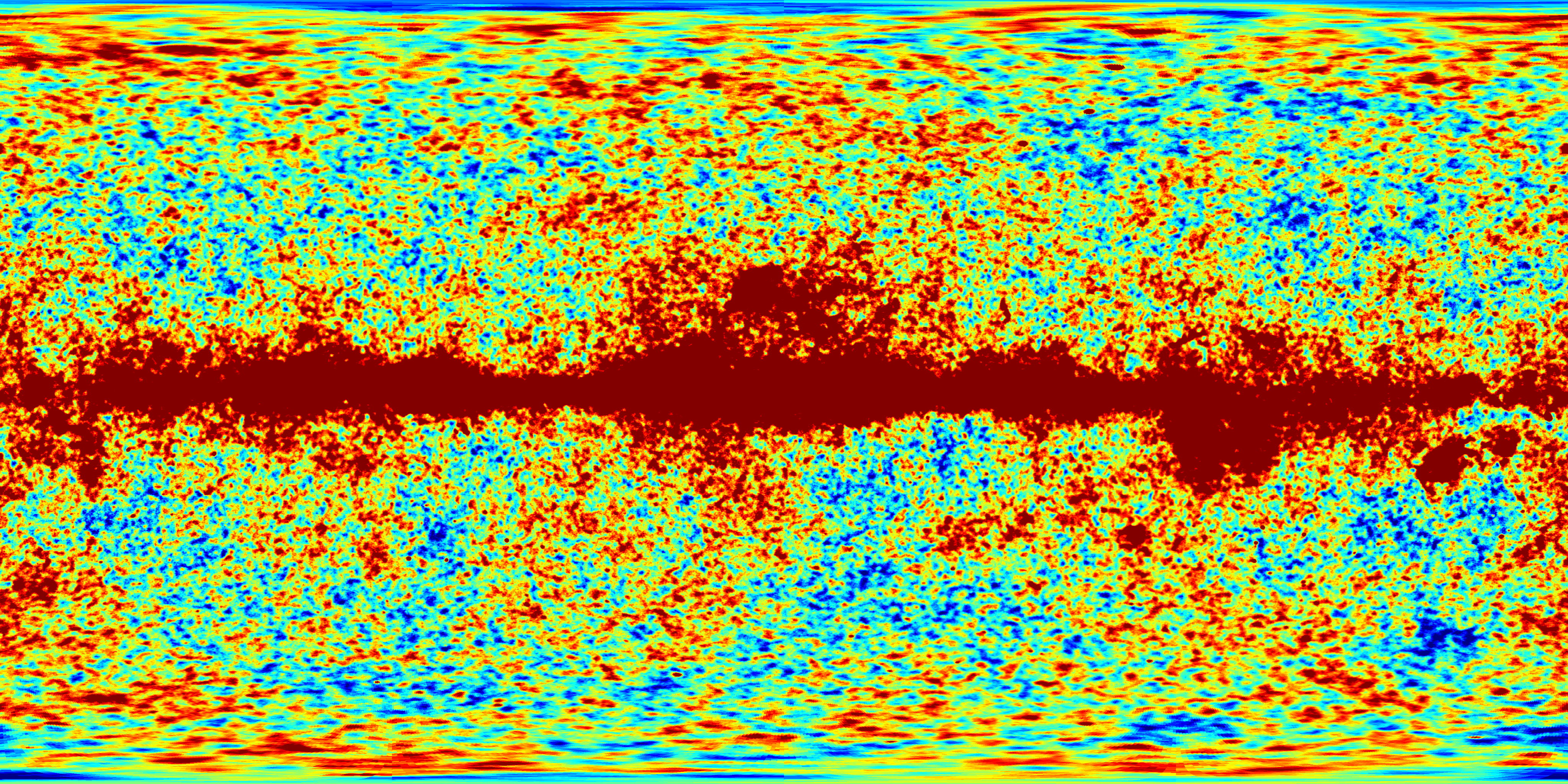
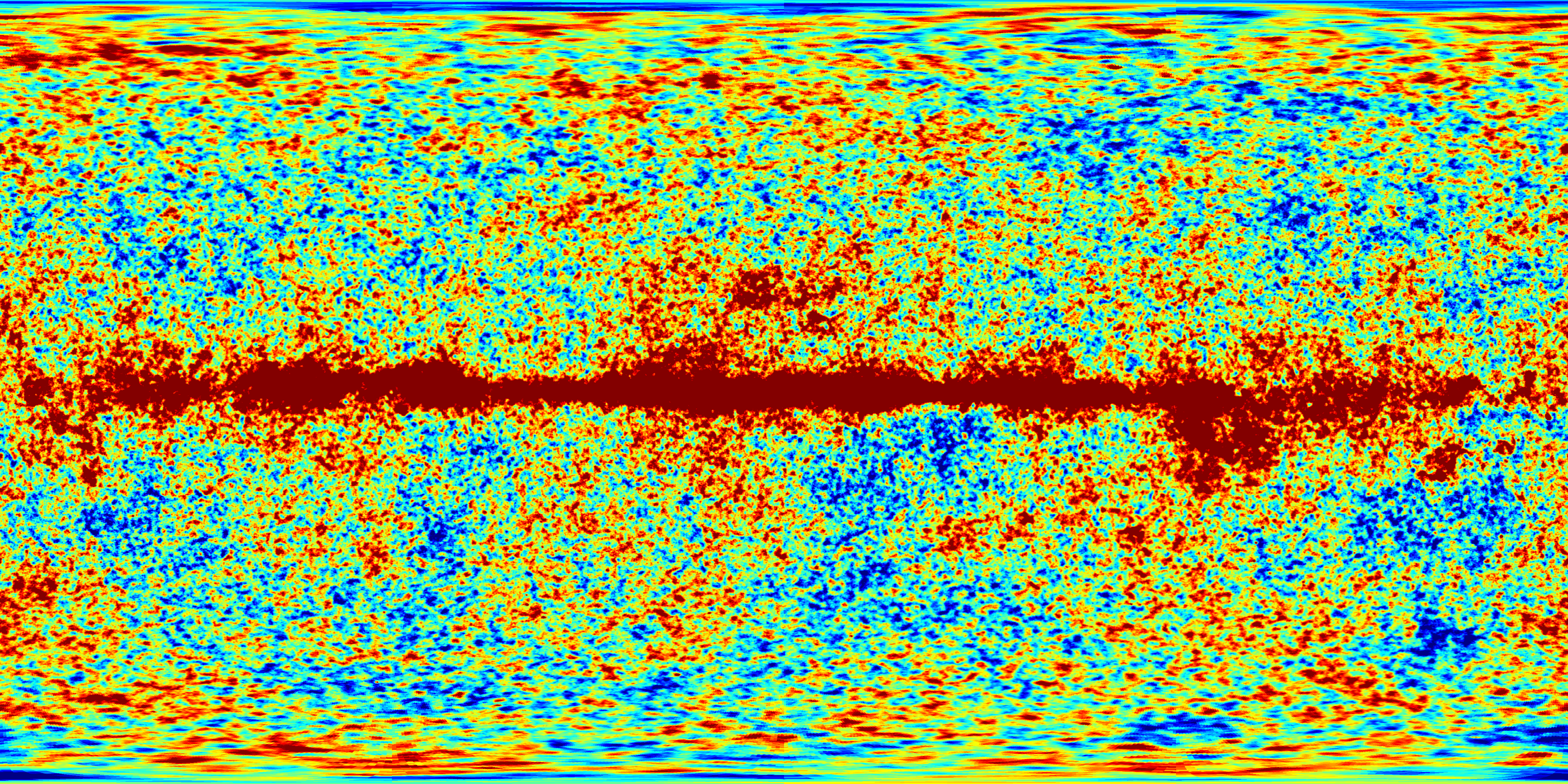
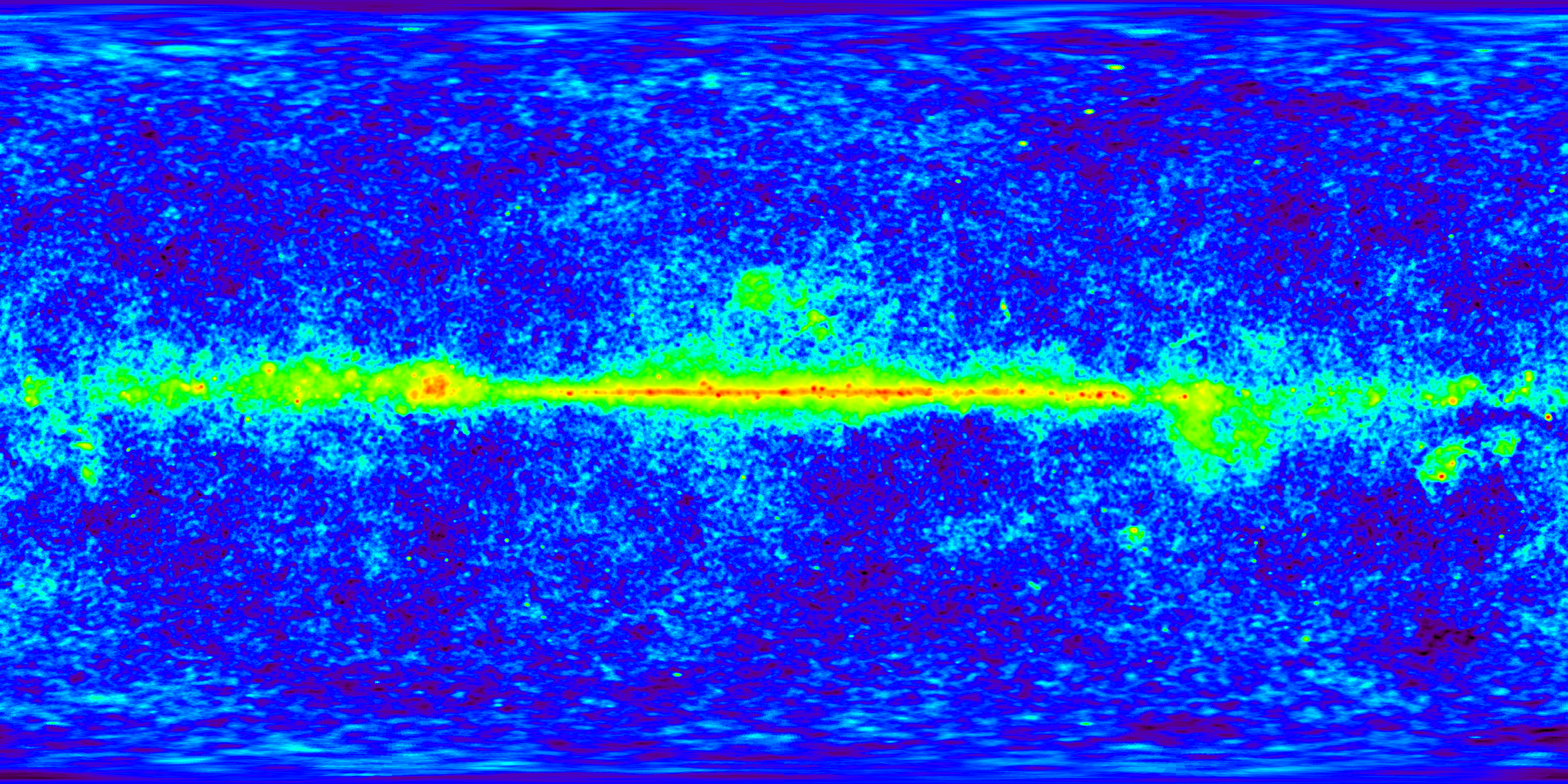
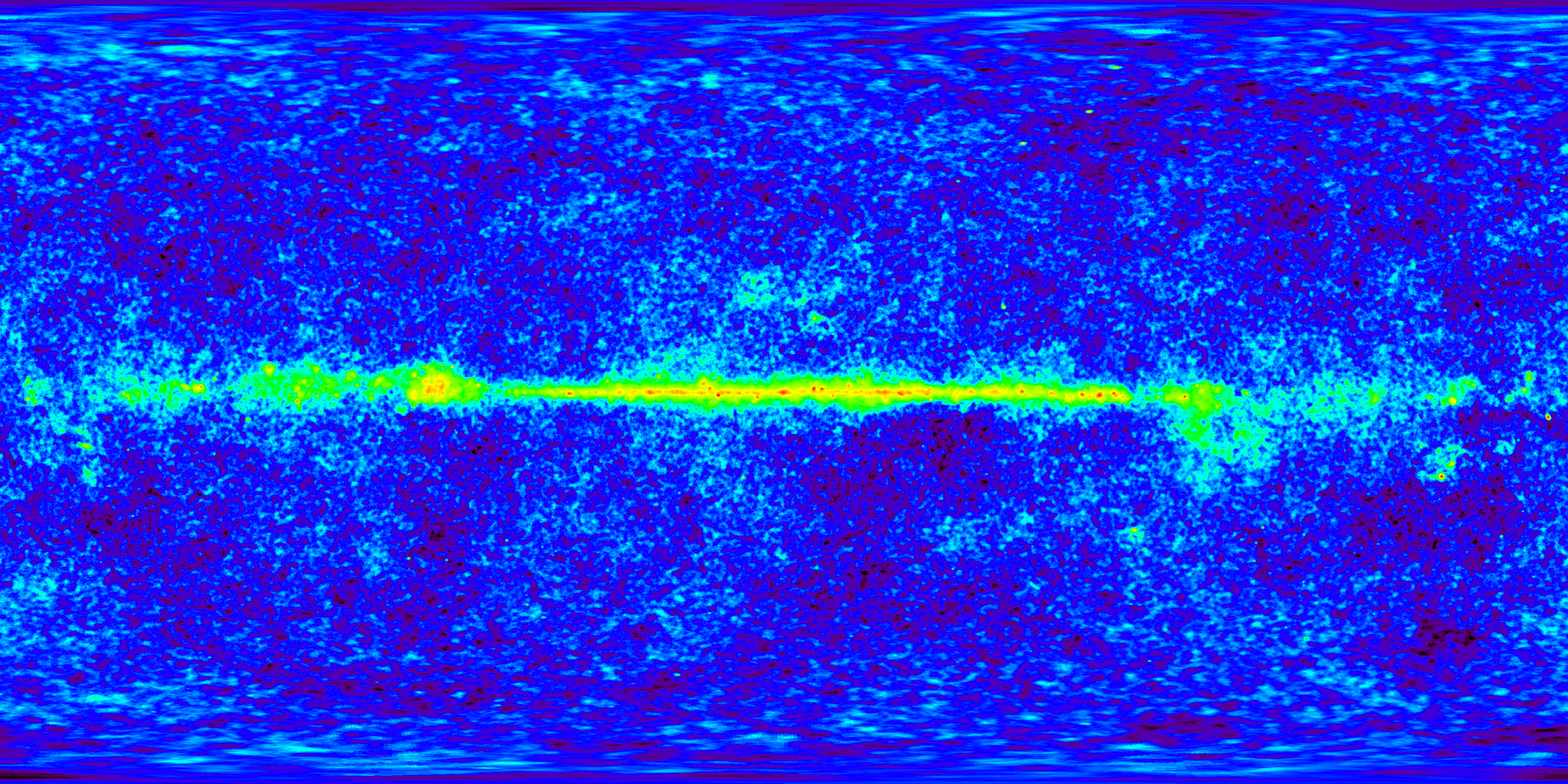
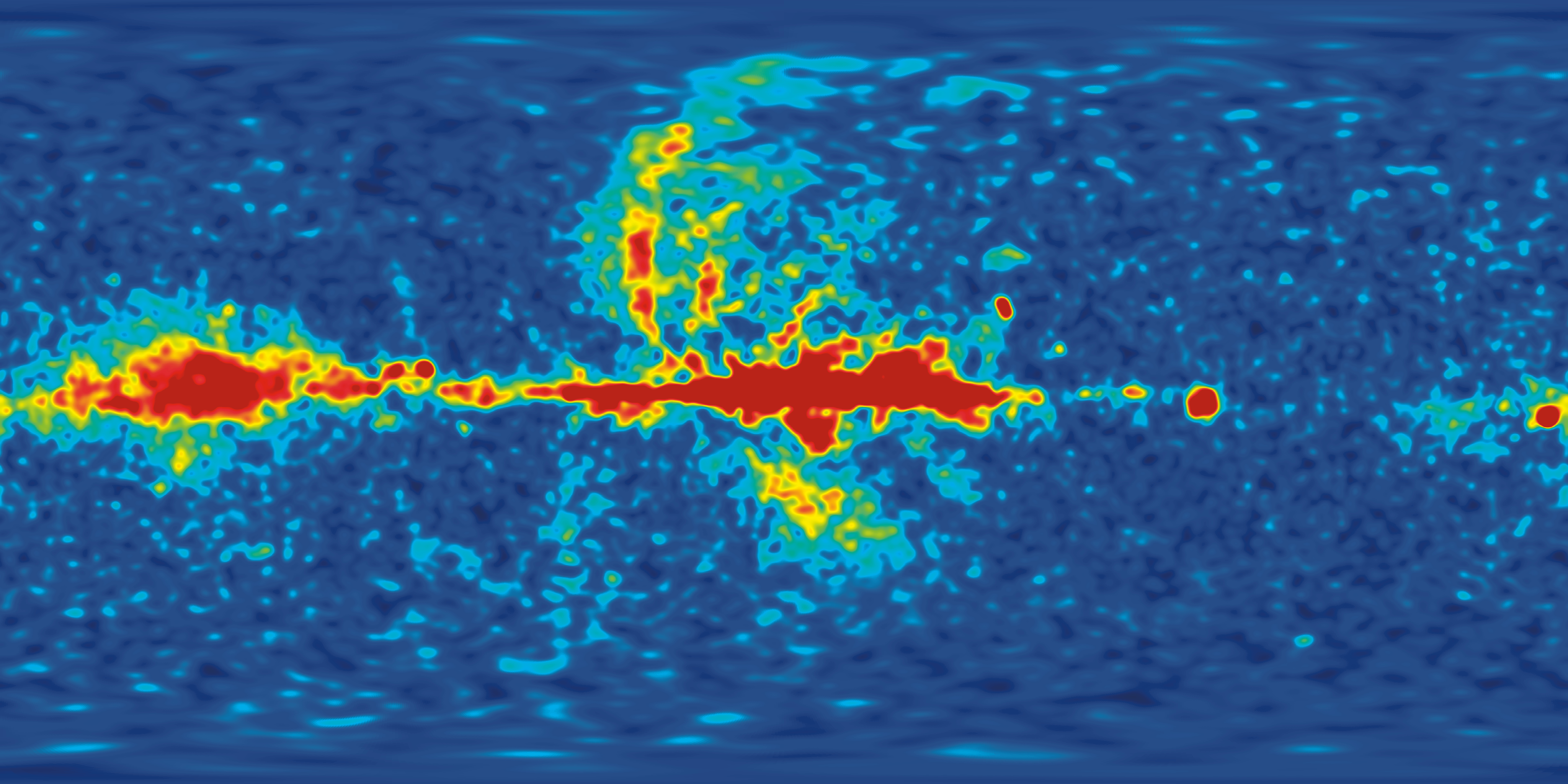
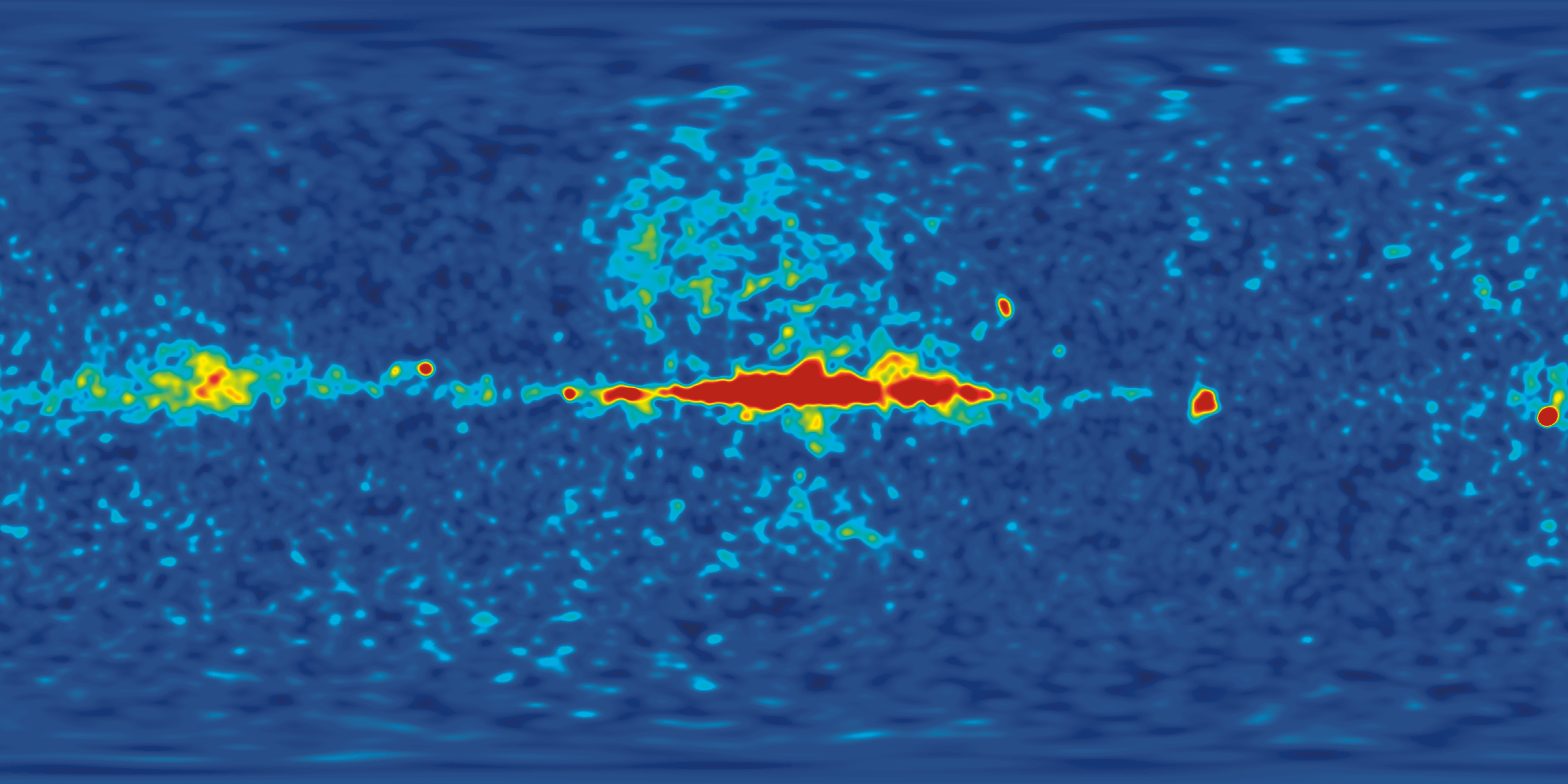
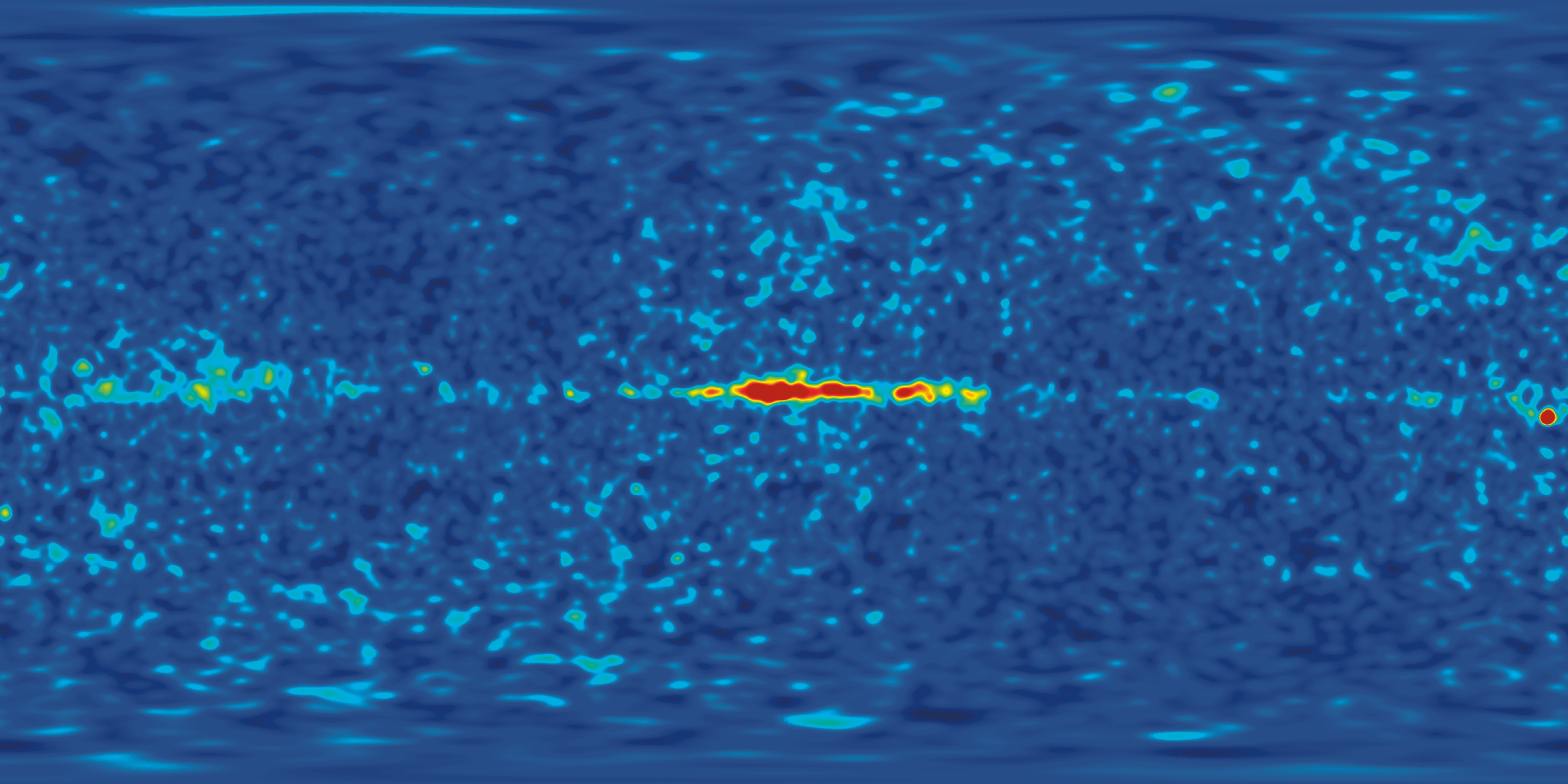
WMAP Seven Year Frequency Band Maps (Nonlinear Color Scale) |
||||
 K Band -- 23 GHz |
 Ka Band -- 33 GHz |
 Q Band -- 41 GHz |
 V Band -- 61 GHz |
 W Band -- 94 GHz |
| These are the same five images as above, except the color scale is distorted to show both the faint variations in the CMB and the much brighter variations in the Milky Way signal. | ||||
WMAP Seven Year Polarization Maps by Frequency Band |
||||
Without Polarization Vectors | ||||
 K Band -- 23 GHz |
 Ka Band -- 33 GHz |
 Q Band -- 41 GHz |
 V Band -- 61 GHz |
 W Band -- 94 GHz |
With Polarization Vectors | ||||
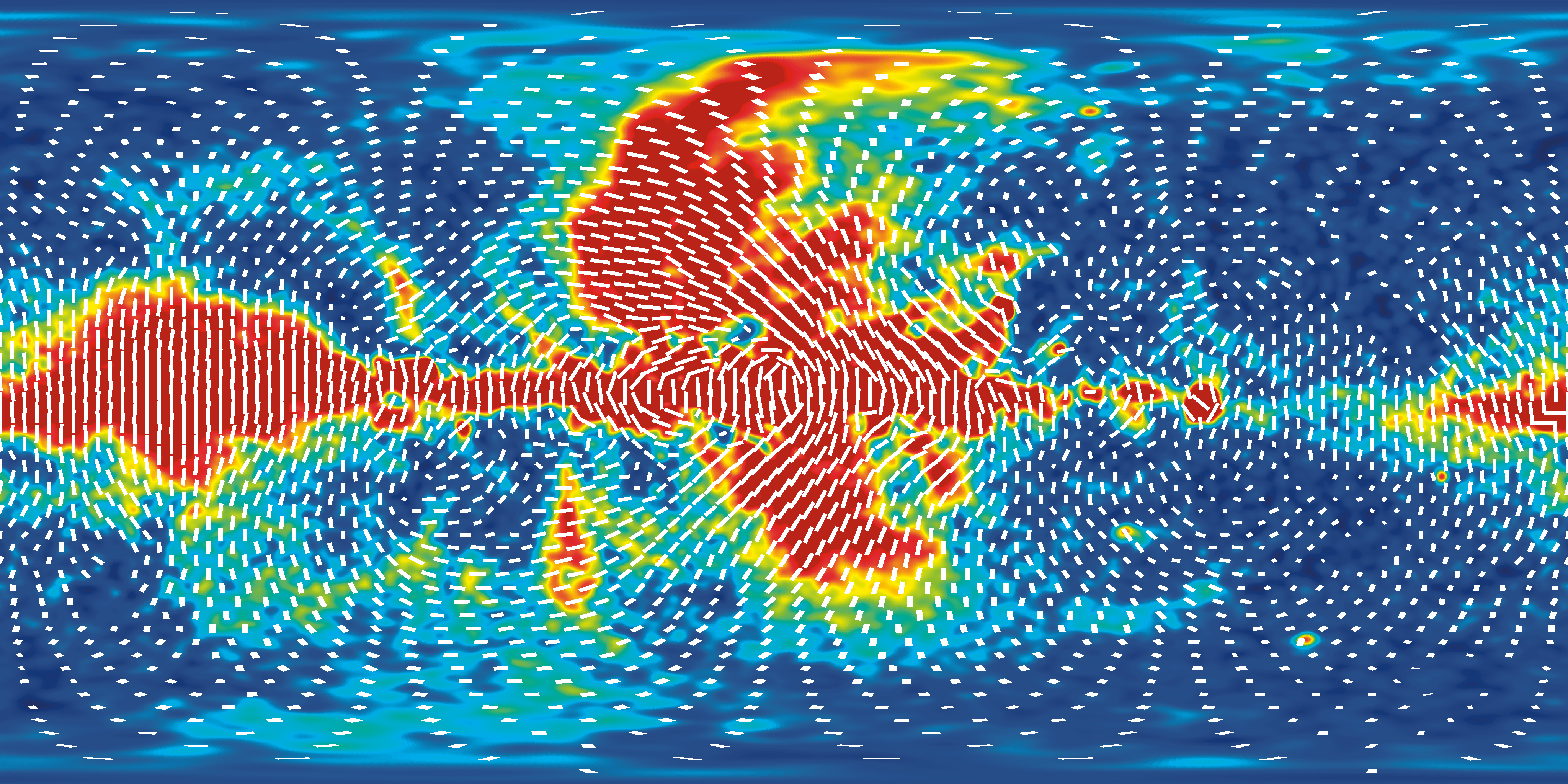 K Band -- 23 GHz |
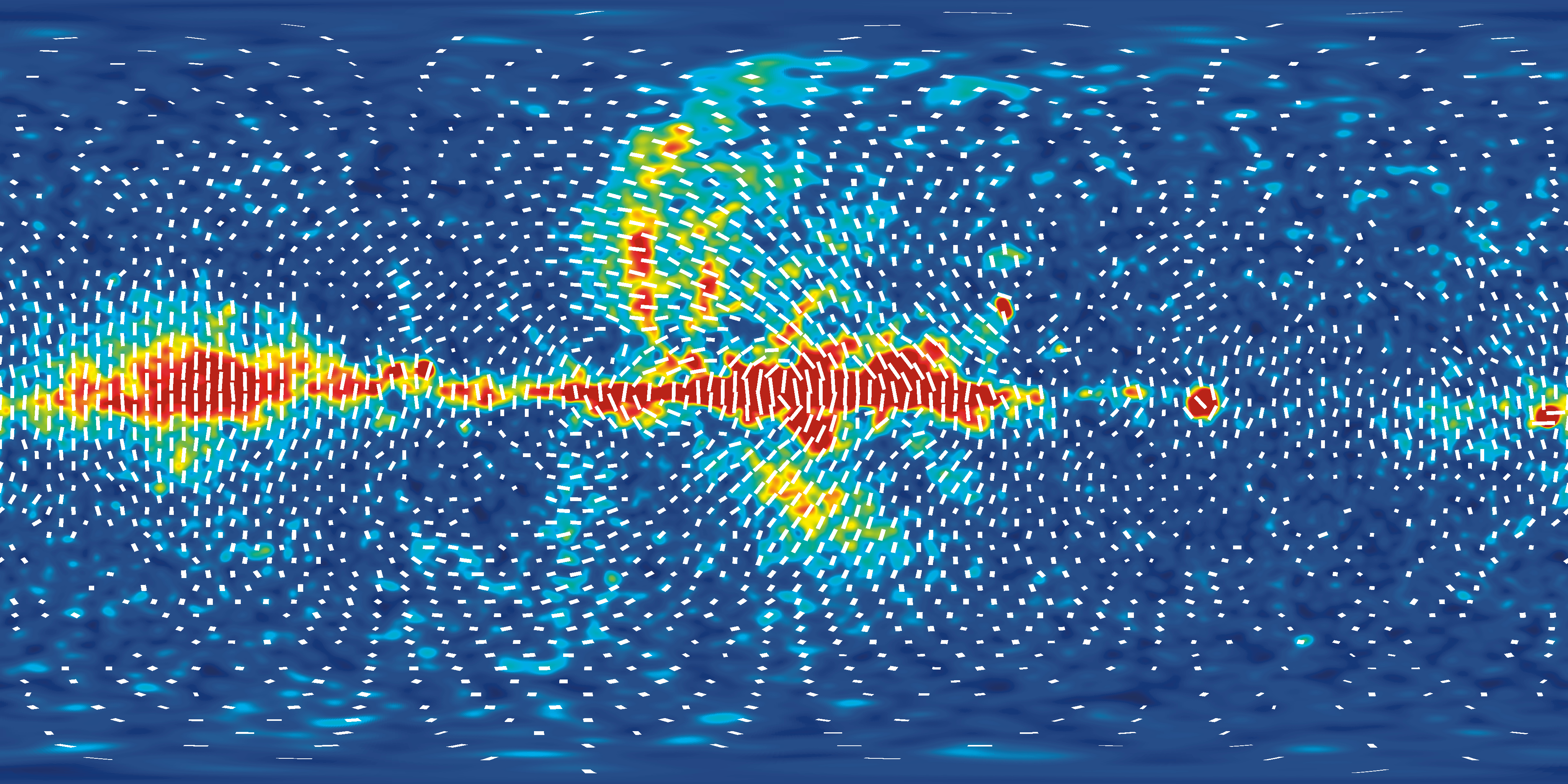 Ka Band -- 33 GHz |
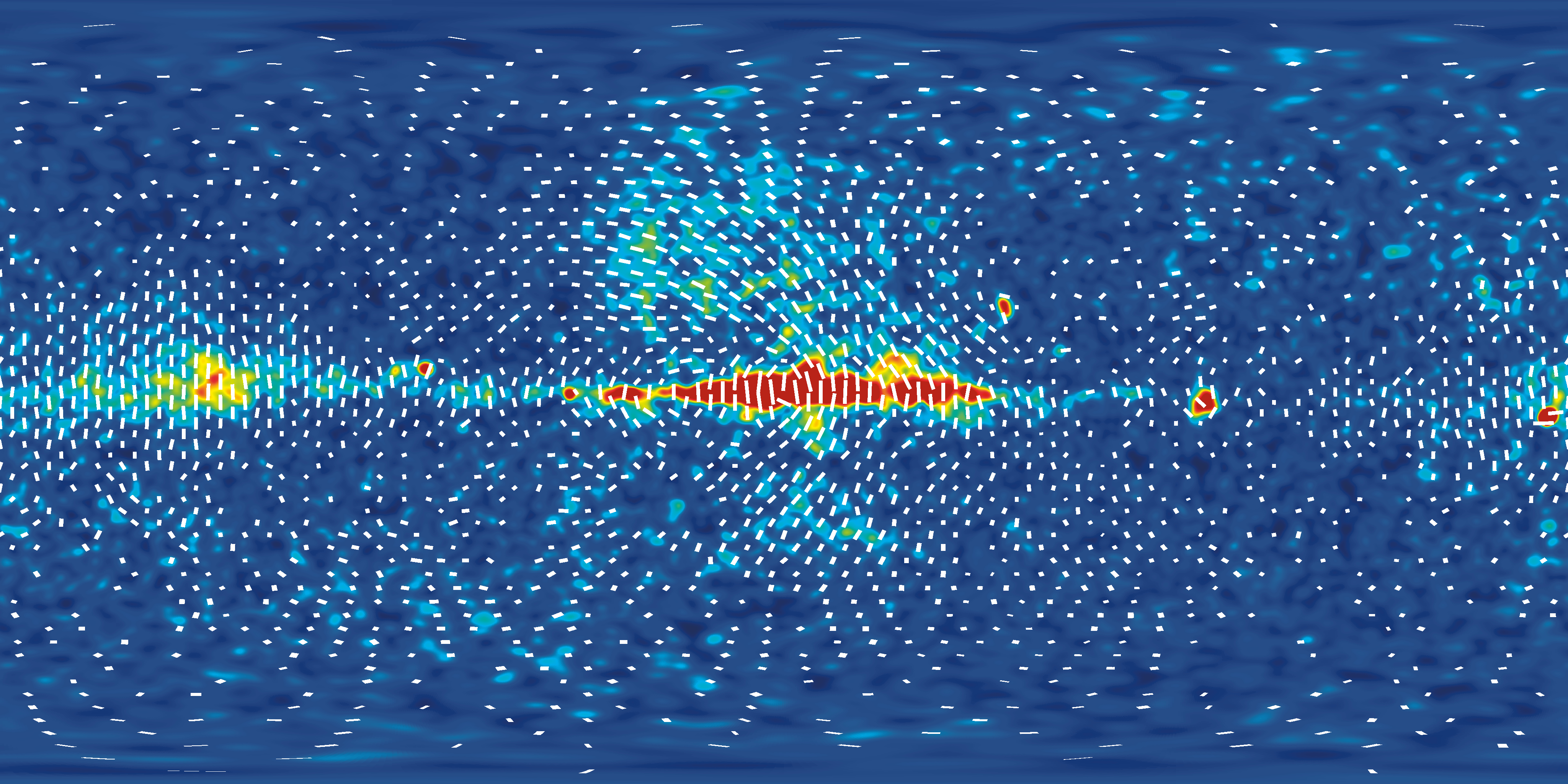 Q Band -- 41 GHz |
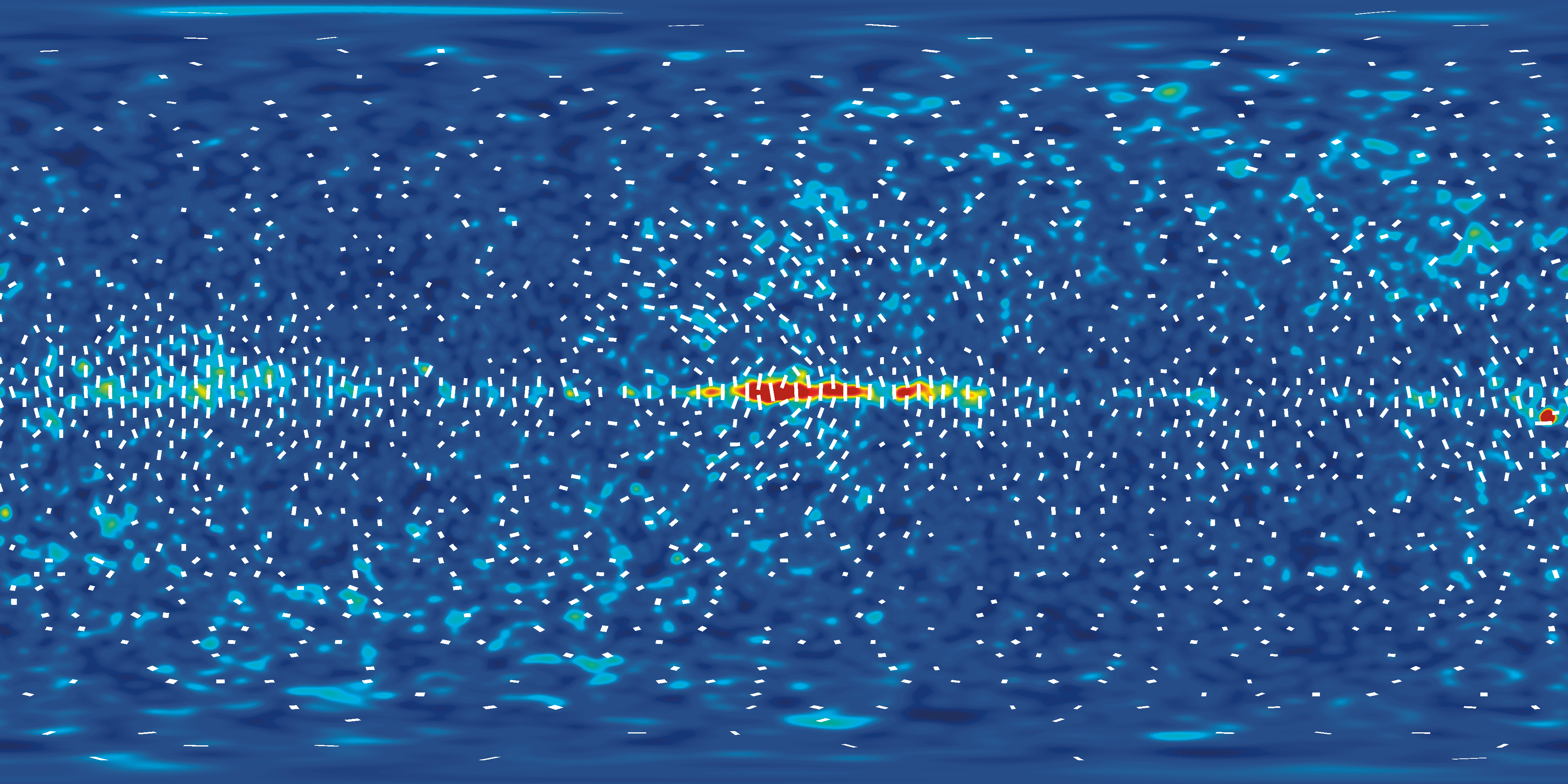 V Band -- 61 GHz |
 W Band -- 94 GHz |
In addition to measuring brightness variations, the WMAP mission is also capable of measuring a more specialized property of the microwaves called polarization. CMB polarization can provide information about when the first stars turned on and whether there were gravity waves in the very early universe. These images show the polarized portion of the microwave signal at two of the five frequency bands: 23 and 33 GHz. The color represents the strength of the polarization: blue is no polarization while red is relatively strong; the color scale ranges between 0 to 50 μK for K band and between 0 to 35 μK for the other bands. The white vector lines indicate the direction of polarization. (The segment lengths are logarithmically proportional to the strength of the polarization, and they are not drawn where the polarization is weak enough that it cannot be distinguished from instrument noise.) The signal seen in the polarization maps arises almost entirely from our own Milky Way Galaxy. Specifically it is mostly due to "synchrotron radiation" that is produced by high energy electrons spiraling around magnetic field lines in our Galaxy. As with the brightness variations, the polarized signal can be largely suppressed by combining multifrequency data. Once this is done, the CMB polarization left behind tells us that the first stars in the universe first formed when the universe was about 400 million years old. As of yet, the polarization provides no evidence for gravity waves in the early universe. |
||||
Projection Conventions
The Science on a Sphere (SOS) exhibit was originally designed to show the Earth and various other planets, which are easily represented as spheres we view from the outside. When using the Science on a Sphere to represent the sky, one has to pick some nontrivial visualization conventions. This is because it is much more natural to think of the sky as a sphere that we view from the inside.
One possible approach is to map the sky onto the sphere as directly as possible. When we look in some direction on the sky, we can specify that direction as a vector, and color the sphere at the tip of that vector according to what we see. This means that the sky would look correct when viewed from the center of the sphere. However, when viewed from outside the sphere, all of the features on the sky (constellations, for example) would appear to be backwards---mirror images of how we usually see them.
To rectify this problem, one can do a parity transform of the projection. This can be thought of as mapping each point on the sphere to the point directly opposite (and then doing some rotations so the North Pole is on top again, if desired). This will turn the constellations right side out, for a viewer outside the sphere, although it becomes slightly more difficult to explain how the image on the sphere corresponds to the visible sky.
The Science on a Sphere images here use this convention, where the constellations are right-side-out when seen from the outside. Note that if the other convention is desired, this can be achieved by flipping the images left-to-right in an image editing program.
The Science on a Sphere projection is a simple latitude-longitude grid, also known as an Equatorial Cylindrical Equidistant projection (ECE). See the SOS web site for details and sample images: http://sos.noaa.gov/index.html
The images projected here have the galactic center in the center of the image. The Galactic North pole corresponds to the entire top edge of the image, and the Galactic South pole corresponds to the entire bottom edge of the image. The left and right edges have galactic longitude l=180 degrees. This orientation was chosen because the galactic center is usually the most recognizable, and so it was put in the center of the rectangular image.
Also available: